Thursday, 31 October 2013

Final Anaysis of NME and Kerrang Front Covers - Similarities and Differences

After annotating both of the NME and Kerrang Music Magazine front covers, I can clearly identify different features on a front cover magazine. I now have a better understanding as to what features I must include when it comes to creating my own front cover magazine page. In order to make my magazine more appealing to the demographic I will include the features such as a masthead, headline, banner etc. This is so my magazine will look more professional to my audience. From comparing and contrasting both of these magazine front pages I can identify similarities and differences between the pages.
 
The similarities of these page are that both of these front pages display a Masthead, which is the title of the magazine. It is important that all magazines have a Masthead because the reader can recognise what magazine they are buying and know what genre the magazine is. The pages also have other features that are included on most magazine covers, for example there is a headline to show the main story within the magazines and a bar code to show the price and the overall quality of the magazine. Pugs and Puffs are used on the front page to show the additional content that the reader can find within the magazine and particular buzz words are used to help promote the additional features within the magazine. A main image of the music bands has also been presented on both of the front covers which shows that they are the main focus of the magazine. The image of them appear larger than any other features on the page and takes up most of the page to show that they are the dominant feature within the magazine and throughout. 
 
The differences between both of the front pages are that both magazines are associated with different genres which suggests that the magazines will come across differently to the audience. Both magazine have the same type of house-styles but  have different bands that are associated to a particular genre. The NME magazine has a red, white and black house- style and displays the band Mumford and Sons which suggests that the magazine is associated around indie rock as the band displayed are an indie rock band. The Kerrang front cover magazine has the same coloured house-style as the NME magazine however the cover uses more of the black colour in the background of the page. The dark and black coloured background will give the reader the connotation that the magazine is associated around the genre of heavy metal or rock. In addition to this, the red and bold font used on the page also connotes with the chosen genre of the magazine. The band displayed on the front cover of the Kerrang magazine is presented in front of the Masthead and they are appeared with blood running down their faces which connotes that they come along as an aggressive and threatening figure to the audience. This suggests that they are more important than the Masthead itself and are going to be the most dominant feature within the whole of the magazine.


Wednesday, 30 October 2013

Music Magazine Analysis - Kerrang Front Cover

I am going to annotate another Front cover Music Magazine, however I have decided to pick a different genre compared to my other previous analysis of NME. I have decided to annotate a Kerrang front cover magazine. Similar to my other post on the analysis of a front cover magazine, below I have included a full analysis of this chosen magazine on a word document.


Tuesday, 29 October 2013

Analysing a College Magazine

From analysing one of my previous school college magazine, there are certain features that can be identified which help to promote this cover to its audience. By analysing this college magazine i will be able to get a better insight as to what my college magazine should include.

A feature that stand out to me is the tile of the school at the top of the page 'The Cardinal bulletin'. It has the effect of snow on the letters and the house style of the page is red and white. From looking at these semiotics, these features revealed to the reader gives us the connotation that this college magazine has a link to a relevant topic of christmas. The semeiotics also tells the reader that the school is a catholic and religious school.

The text on the left side of the page states that its the 'Heads Message'. This tells us that the headmaster of the school take a very active role within the schools curricular activities. The images of the students of the page also portrays and conveys how the students take pride and enrich themselves into the extra curricular activities within the school. 

If I was to present this college magazine cover to an audience i would consider putting less amount of text on the page and put one main image on the page. I would also consider putting a larger and more eye-cathing headline on my page.  This will help make the page more appealing and more professional to the readers to look at and will make it more eye-catching for the readers. 

Wednesday, 23 October 2013

Music Magazine Analysis - NME Front Cover

In order for me to create a successful college magazine I must be able to identify certain features within a magazine, using the terminology I know. Beneath I have produced a short presentation using Prezi, which includes a full analysis of a front page music magazine. This is so I have a full understanding of what I must include on my front page cover of a music magazine, to make it stand out and more appealing to my audience.

Please take a few moments to watch my short presentation :)


Tuesday, 22 October 2013

Prezi

In order to produce creative and innovative blog posts I have now become aware of the software named Prezi. Prezi is an online presentation and storytelling software that allows you to present ideas on a virtual canvas. Below is a video explaining what is Prezi, why people use Prezi and why it is a creative way of presenting ideas and other presentations. As a result of this I am going to use Prezi in future blog post to display my creatively within presentations.

Monday, 21 October 2013

Magazine Terminology

As part of producing my college magazine, I will need to have the ability to analyse different features of a magazine, using the media terminology given. There are many different features that can be identified on all pages of a magazine including the front page, contents page and double page spread. These features help to promote the magazine itself by making itself stand out more and more attractive for the target demographic to look at. In addition to this, it will help bring more attention from the audience perspective so they are more likely to buy the magazine.

Beneath I have made a glossary sheet on the different media concepts that can be identified in a magazine as a whole. The terminology includes....

 
Masthead - the name given to a magazine

Headline - the title of the main story within the magazine

House Style - the main colour scheme of the magazine throughout 

Main Image - the image of a person/people/object directly associated with the main feature or article within the magazine. Presented in the centre of the front cover page.

Sell Line - the introductory headline below the masterhead, describing the magazine

Pug - "the ear of the magazine" located at the top left or right hand of the front page magazine. A promotion or a freebie is put there to catch the readers attention.

Buzzwords - words and phrases such as "exclusive" and "win" that are used to catch and draw the readers attention. Helps promote a feature in the magazine.

Banner - a colourful banner across the page with text that helps promote an exclusive feature in the magazine

Barcode - a code and convention that is on every front cover of a magazine and tells us the price and the overall quality of the magazine

Puff - is a graphic feature placed on the front cover of a magazine to make something stand out. Usually presented by putting text around a shape.

Anchorage text - is text that provides the link between an image and it's context

Caption - is text describing an image ( anchorage ) 

Drop Capital - is the first letter of an article that is presented big and bold. It's purpose is to draw the reader to the beginning of the article.

Cover Line - blurbs advertising the other topics featured inside the magazine 

Tuesday, 15 October 2013

Preliminary Task

As part of my coursework I have been told that I must produce a college magazine front cover. Along with this, I must include an example and analysis of a front page,  a contents page and a double page spread of a college magazine in my blog post. This will help me with my planning and researching. I will be able to have a better and clearer understanding as to what features I must include on my page, to make my front cover stand out and more attractive for my audience to look at. 
 
Already I have found out that on my front page design I must have a medium shot image of someone to be presented on the magazine. This is to make sure that my front page magazine looks  professional. In addition to this, I am tasked to do a mock up of a contents page as well. In order to do this, I will use the Photoshop program to help me design my product.


Sunday, 13 October 2013

Applying the Male Gaze to Scenes

The male gaze is a concept that is used in todays society and world. It can be applied to all types of different media, whenever that is on a magazines cover, advertisements or certain scenes in films. In this video clip taken from a single episode from Hollyoaks , shows how Rachel Shenton, who plays as a character in Hollyoaks is represented to the audience in different scenes. This clip shows how her character applies the male gaze theory to the representation of her character.


At the begging of the scene Rachel Shenton is seen wearing a short pink skirt, high heels and a handbag walking down the road portraying a sexy and attractive image of herself. The camera movements and editing help portray this image. For example a close up is used on her face in the first edit to show her appearance and a camera tilt looking up from the ground is used to represent her body image. Slow motion editing has been used to help portray her provocative side and the use of high key lightening has been used on her character to connotate that she is the dominant figure to look upon. This follows on to why her character helps answer why the male gaze is being applied in the video clip.
 
When Rachel walks into the bar, she is looked upon suddenly by other characters. Within the scene the two male characters are constantly staring at her and this follows on to another scene of the episode to were she allows a picture with the two males kissing her. This makes her figure more notified and objectifying to the other characters and the audience watching.  

Saturday, 12 October 2013

Feminism

What is Feminism ?

Feminism is the belief that men and woman are and have been treated differently  by our society and that woman have been frequently been unable to participate fully in social arenas and institutions.


The History and Origins of Feminism

Historically feminism has evolved between the sexes to a deeper focus on the social and performative construction of gender and sexuality. Woman had traditionally been regarded as inferior to men physically and intellectually. In past events woman could not possess property  in their own names, engage in business or control the disposal of their children or even their own persons. However over time woman have evolved to have more freedom and have equal rights as men do.

During the 1920s woman in the United States were divided on the question of equal standing with men, which was advocated by the National Woman's Party. This included limiting the number of hours woman could work per week and excluding woman from certain high - risk occupations. Then in 1946 the UN commission on the status of woman was established to secure equal political rights, economic rights and educational opportunities for woman throughout the world. Now the national woman's party and other woman groups pressed for such changes such as abortion rights, equal pay for woman, the occupational upgrading for woman, the removal of all legal and social barriers to education and economic power for woman.


Famous Feminists and their Beliefs

Florence Nightingale was a famous feminist. She was born in a wealthy family, with parents who expected her to do all the things young ladies of her class did such as taking occasional rides in carriages and attend party's and dinners. However she wanted a higher calling in life. Florence wanted to work and use her intellect, skills and moral passion to make a difference in the world. She decided to become a nurse and help others who were in need. Her decision to do this inspired others to do the same.


There are many famous feminists today including well known singers such as Madonna and other famous celebrities such as Oprah Winfrey and Hilary Clinton. All of these feminists have different views on the way woman are portrayed in todays world and society.


Laura Mulvey Theory (1975)
 
Laura Mulvey applied the term 'Male Gaze' to her theory in 1975.  The concept of gaze is one that deals with how an audience views the people presented in a particular scene or image. In feminism the male gaze can be thought of in 3 different ways. These ways can apply how men look at woman, how woman look at themselves and how woman look at other woman. Laura Mulvey believes that in film, audiences have to view characters from a perspective of a heterosexual male. As audiences watch films without being watched by the characters, they become onlookers of their lives. Therefore in some cases they become voyeurs of the people on the screen. This involves turning the representation of the figure into a fetish.

Here is a video clip from a music video to show as an example on how the Laura Mulvey Theory is applied to scenes.


From analysing this music video the woman presented is seen as a young and attractive figure to look upon. The name of the song 'She's so lovely' also implies how she is presented throughout . At the beginning of the music video she is enhanced and notified by other people as they follow her with their eyes. The singer of the video is seen the dominant gazer upon her as he glares at her the most and refers to her appearance in the lyrics, which makes her character more objectifying to the audience.

However there is some criticism over this theory. For example some woman enjoy being 'looked' at for beauty purposes and the gaze can also be directed towards members of the same gender for several reasons, such as in comparison of body image or in clothing.


Representation of Woman in Music Magazines

Jennifer Aniston is presented on this magazine front cover of the rolling stones and would be objectified as being very pretty and attractive to look at. She has been presented in this way ,in order to catch the ‘male gaze’ and encourage men to buy the magazine. Therefore this supports the Laura Mulvey theory. Jennifer Aniston seen on the cover has nothing to do or relate with music. This shows how the rolling stones have lost their main purpose of the magazine by trying to relate to men more.


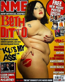
However from looking at this NME Music Magazine front cover, the male audience will have a different perspective as to what is being viewed compared to the rolling stones cover. Beth Ditto shows how woman do not have to be conventionally attractive to be presented on the front page magazine covers. In comparison to the rolling stone magazine, NME has stuck to its roots of music and has not taken away its purpose like the rolling stones. NME has not tried to win male buyers by objectifying woman. Therefore feminists would support this.